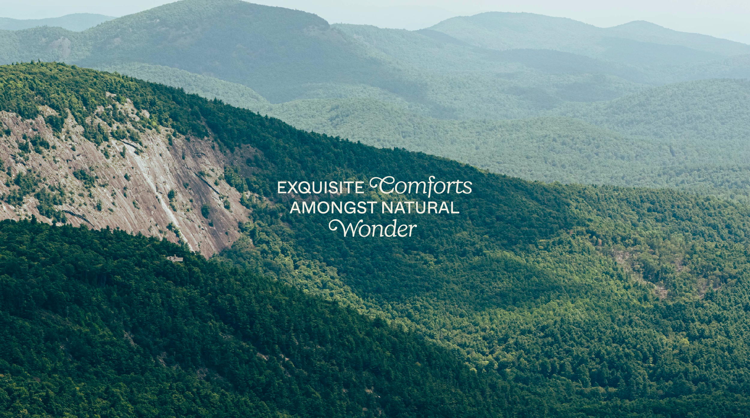
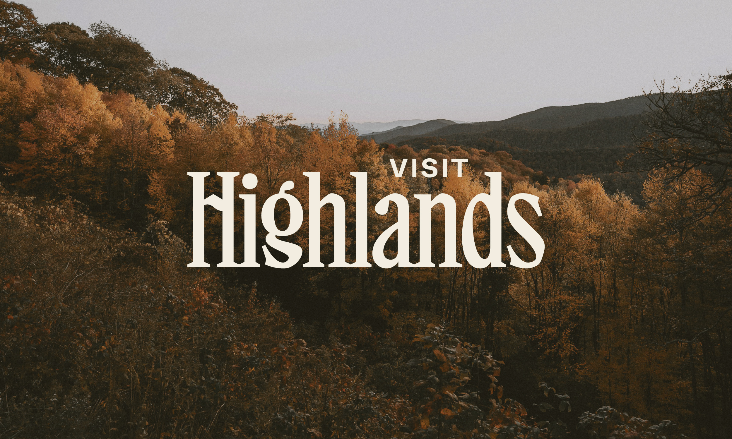
Visit Highlands NC
The Challenge
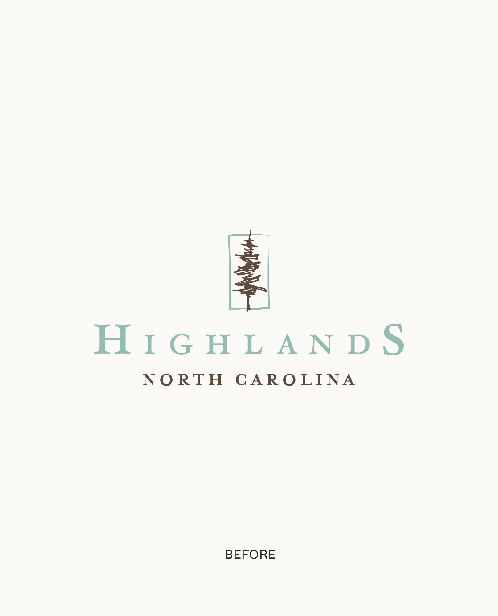
In the past, the tourism department has relied heavily on brands like Old Edwards Inn and Spa and Highlander Mountain House as well as generational word of mouth to draw attention to the destination. Matey was tasked with helping Highlands reclaim its own narrative and create a brand that feels like a holistic reflection of the town while giving it a thoughtful foundation for what comes next.
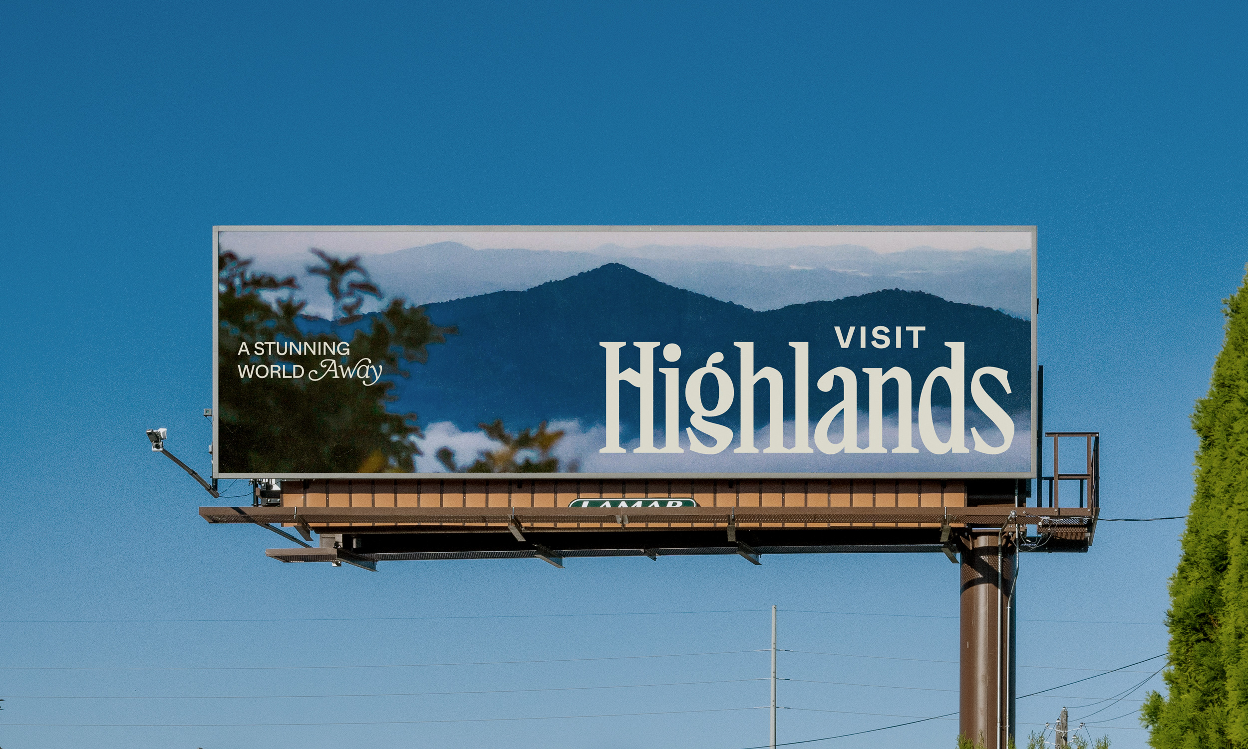
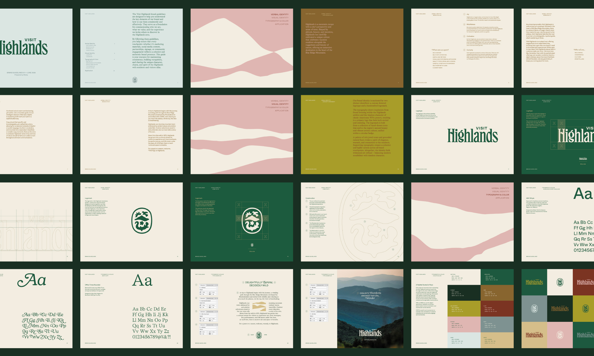
The project gave Visit Highlands a distinctive identity and strategic platform designed for the needs of a growing destination marketing organization (DMO), from visitor communications and seasonal campaigns to stakeholder alignment and place promotion.
Destination Brand Strategy
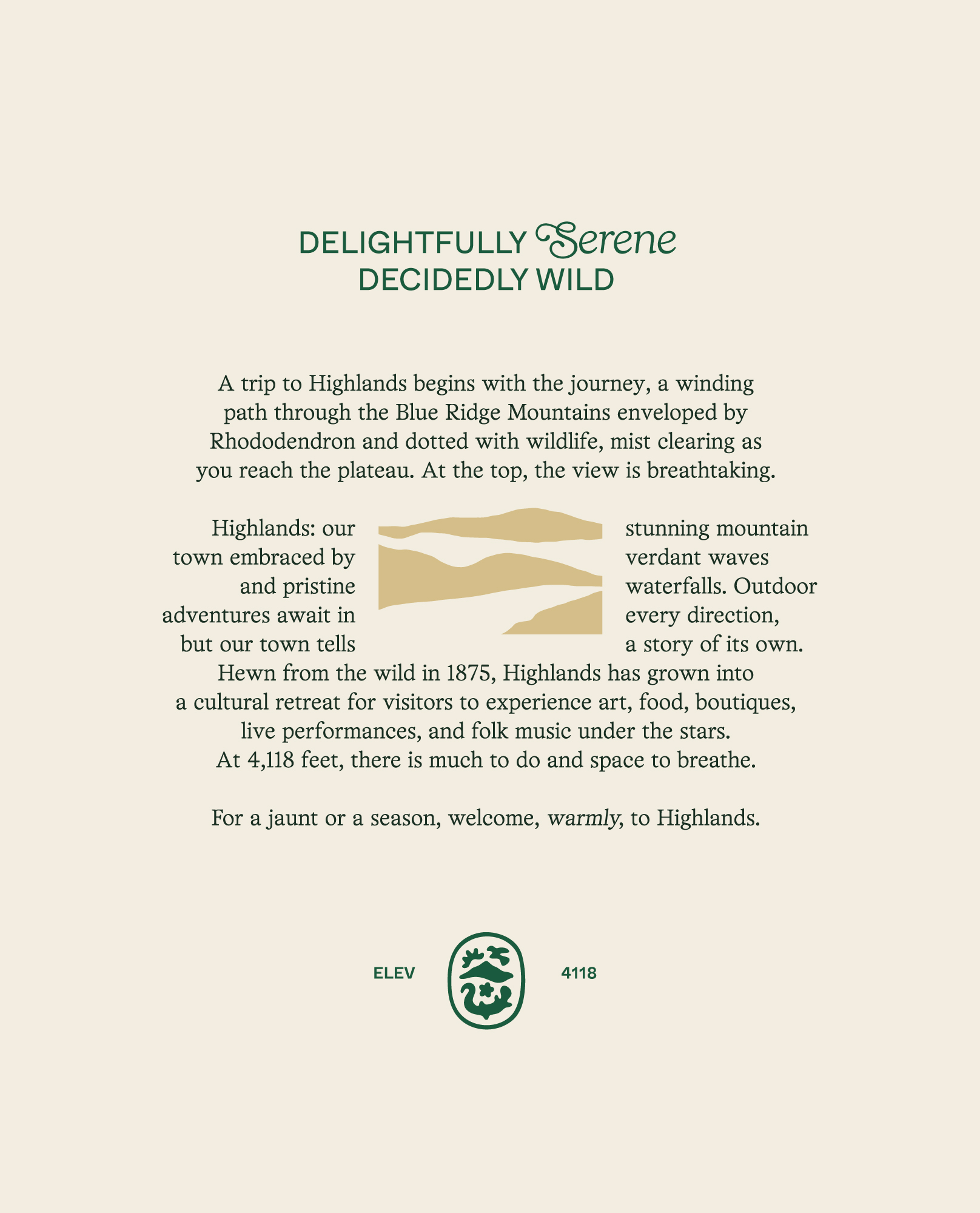
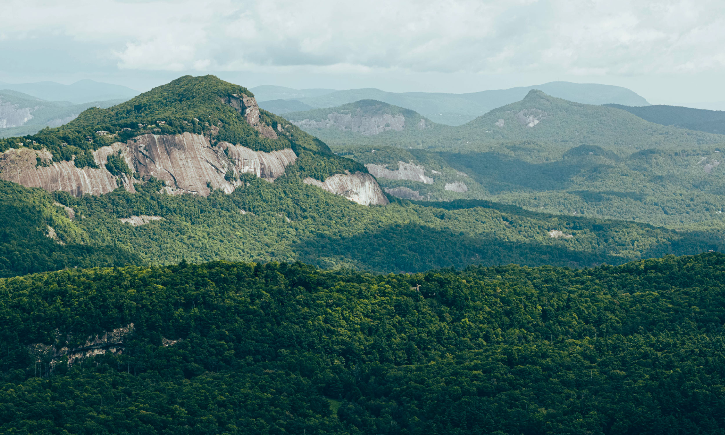
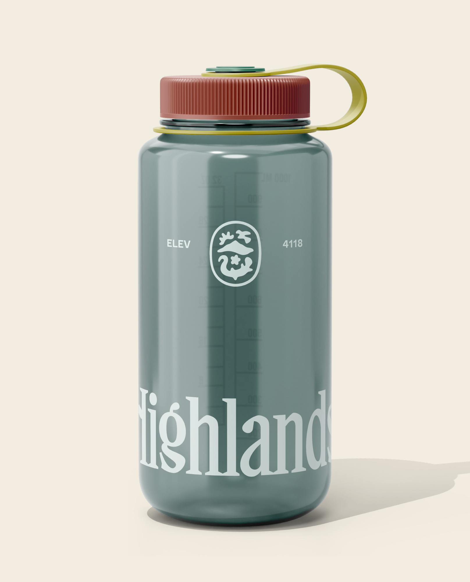
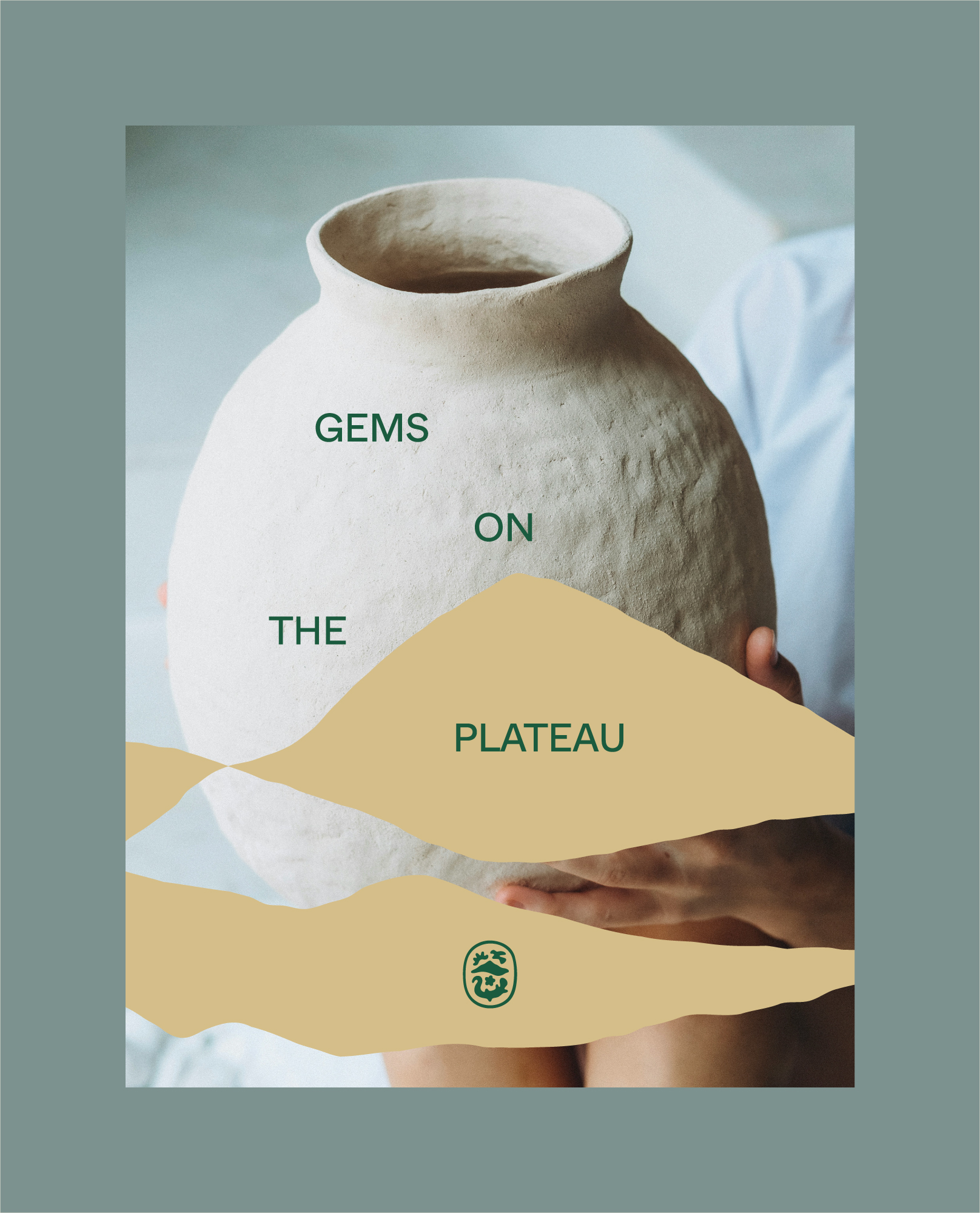
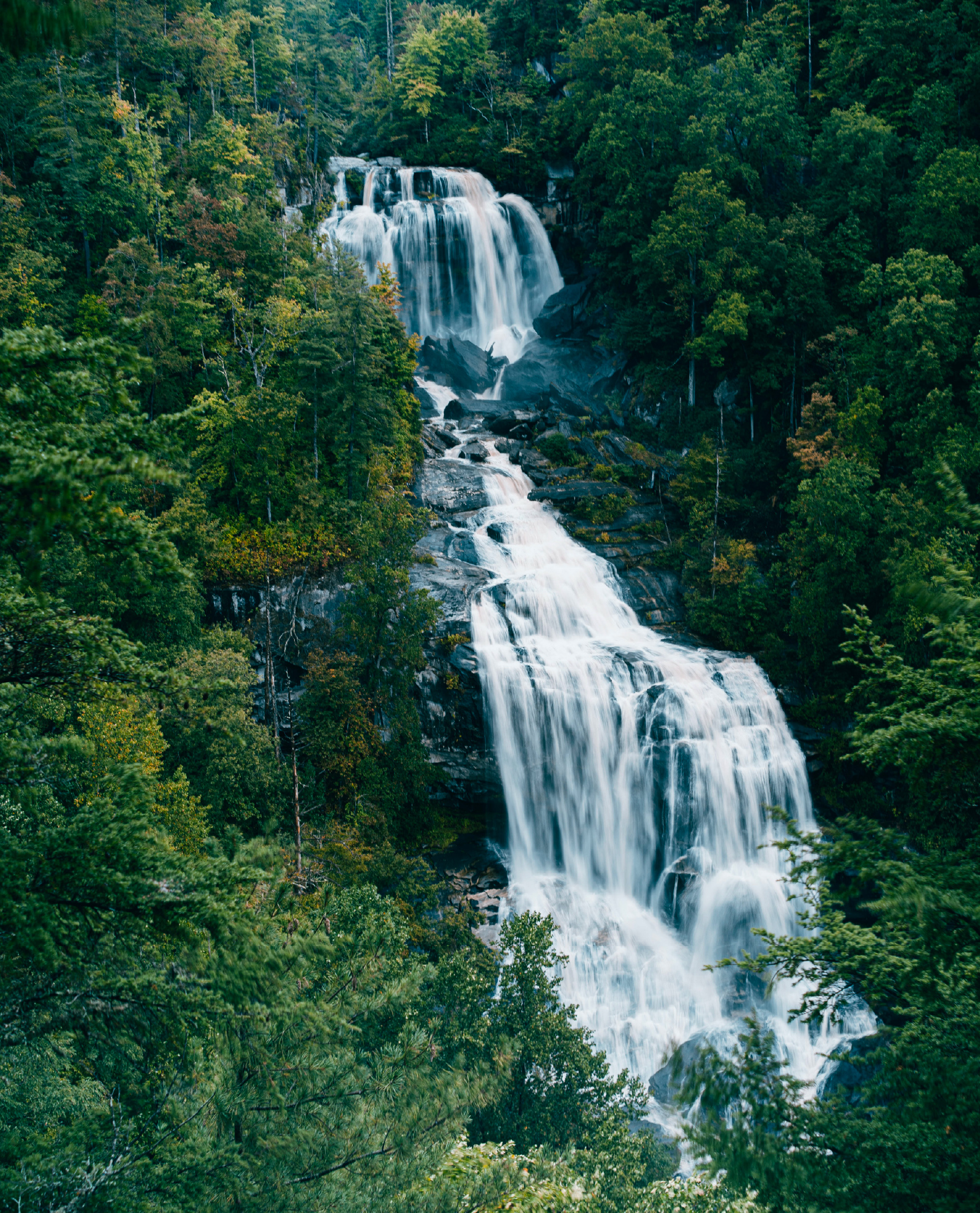
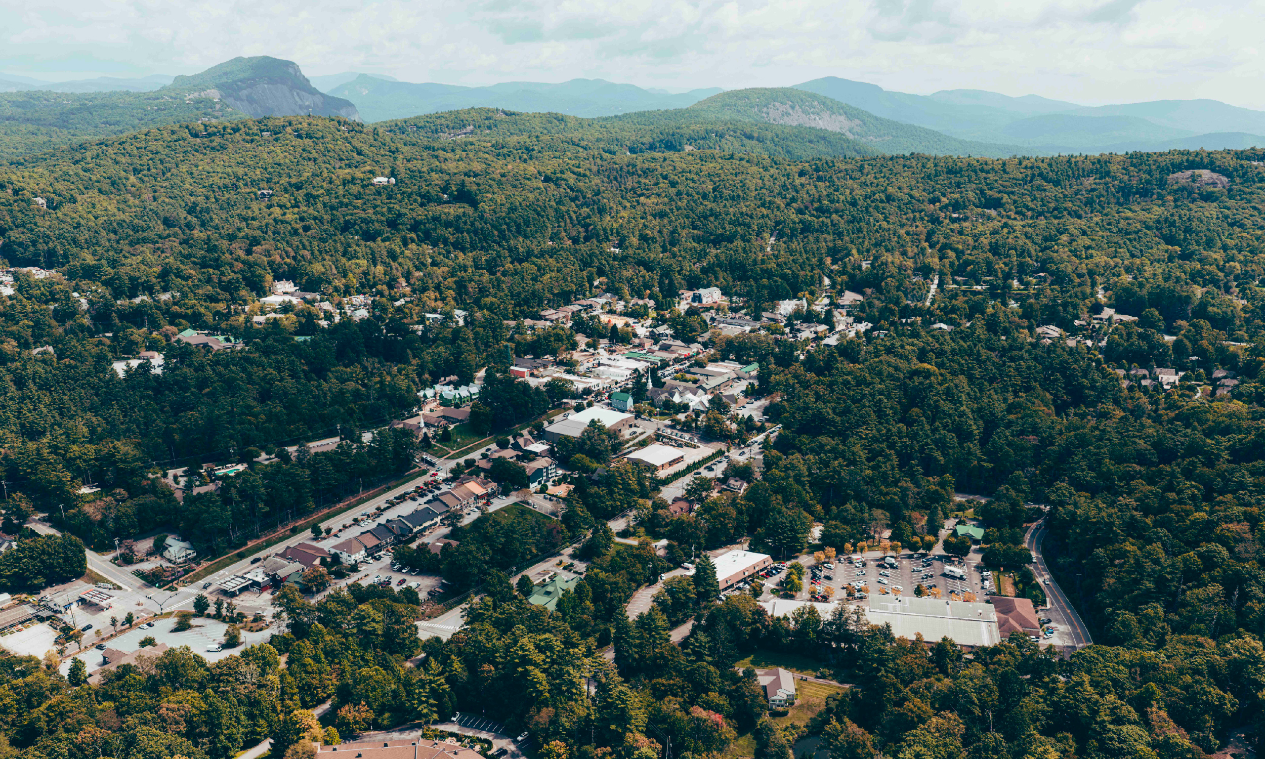
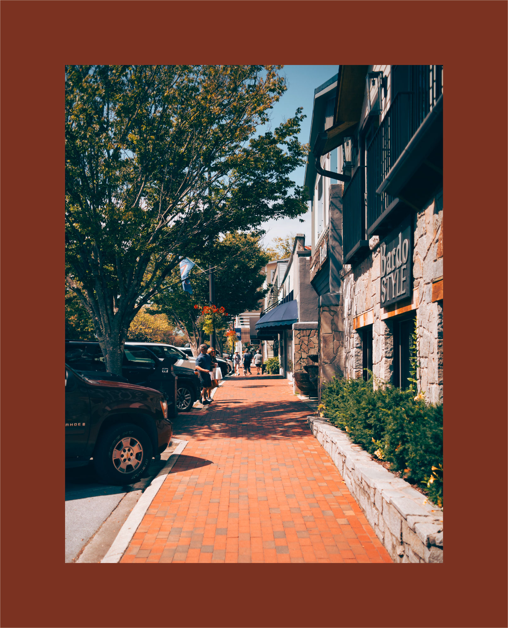
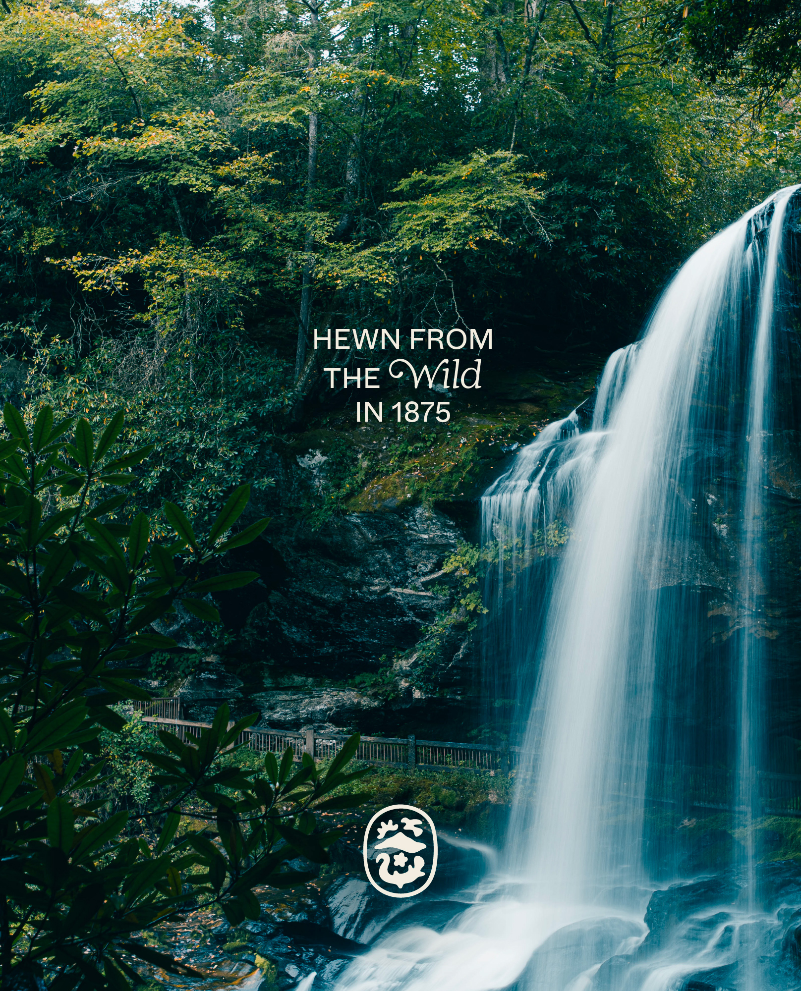
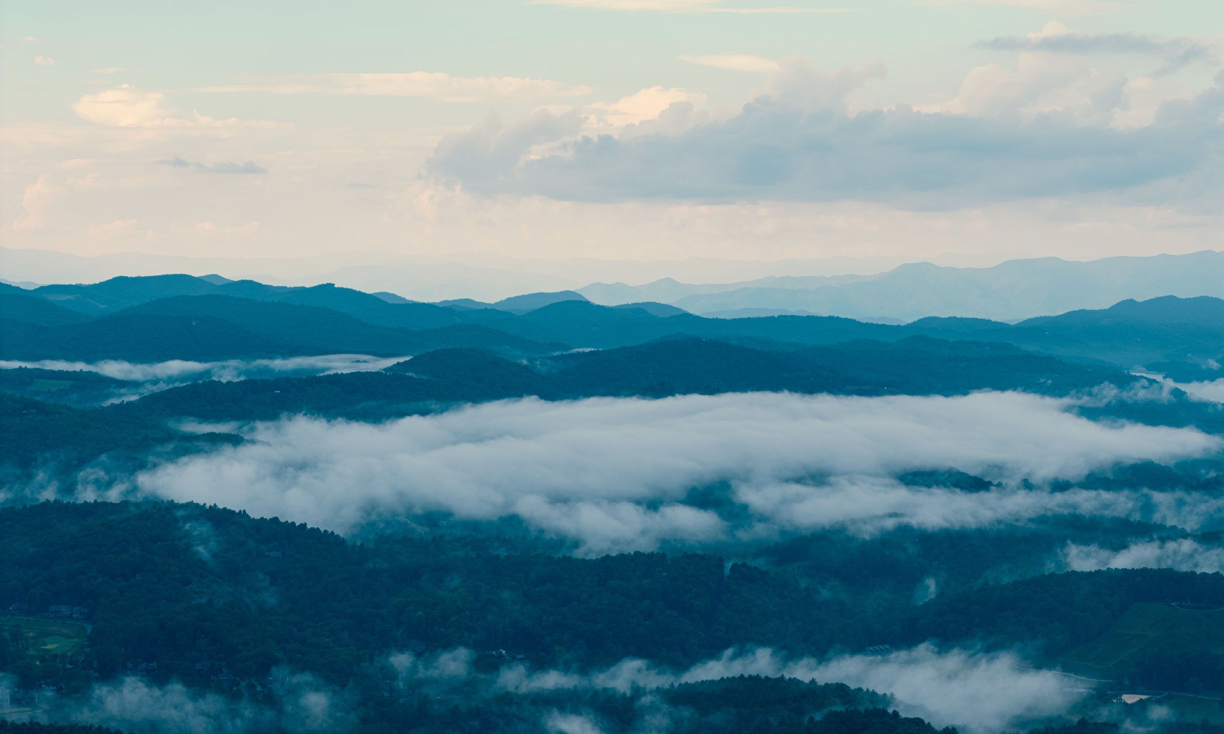
Hewn from the wild in 1875, Highlands has grown into a cultural retreat of art, food, boutiques, live performances, and folk music under the stars. Situated in the heart of the Blue Ridge Mountains, Highlands holds a sense of allure, of magic: there’s more than meets the eye. At 4,118 feet, there is much to discover and space to breathe.
Like the winding ascent to the plateau, Visit Highlands is a guide to that discovery: knowledgeable and assured, if a little wandering at times. An adept host, it offers suggestions in an understated way, knowing that a gem this rare doesn’t need to be touted, just experienced. It welcomes new ideas while placing faith in customs made over time—the more lore-like, the better. And for all its sophistication and vacation comforts, there remains a slight wildness that feels almost fairytale. Like any good story, Highlands reveals itself slowly, giving you a reason to keep coming back for more.
The Visual Identity
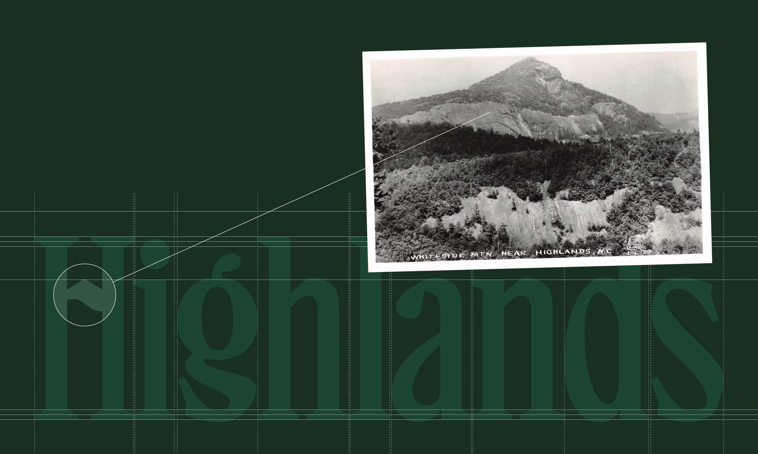
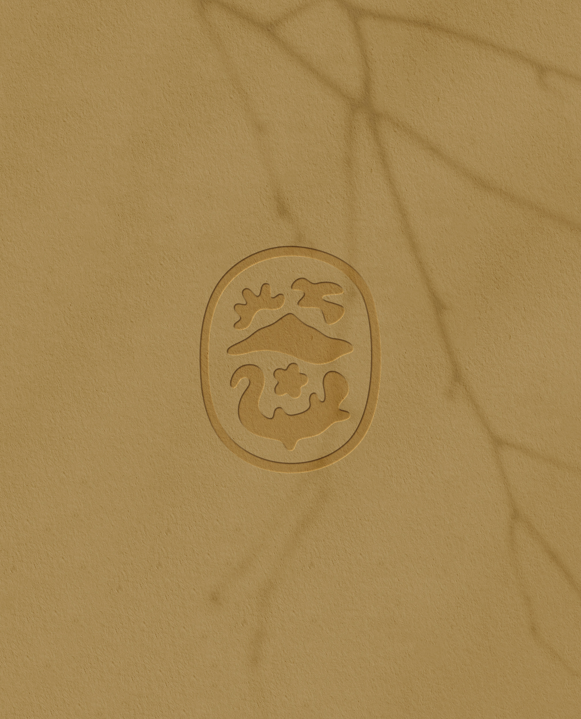
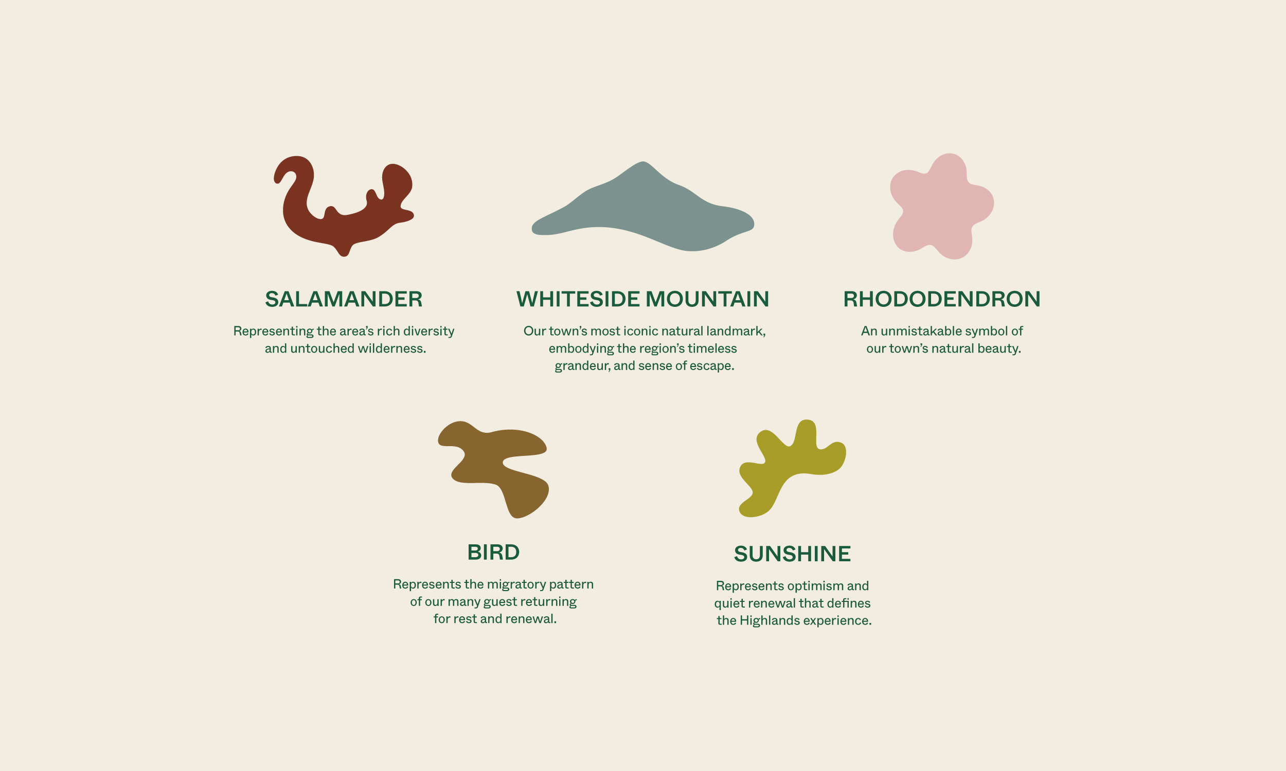
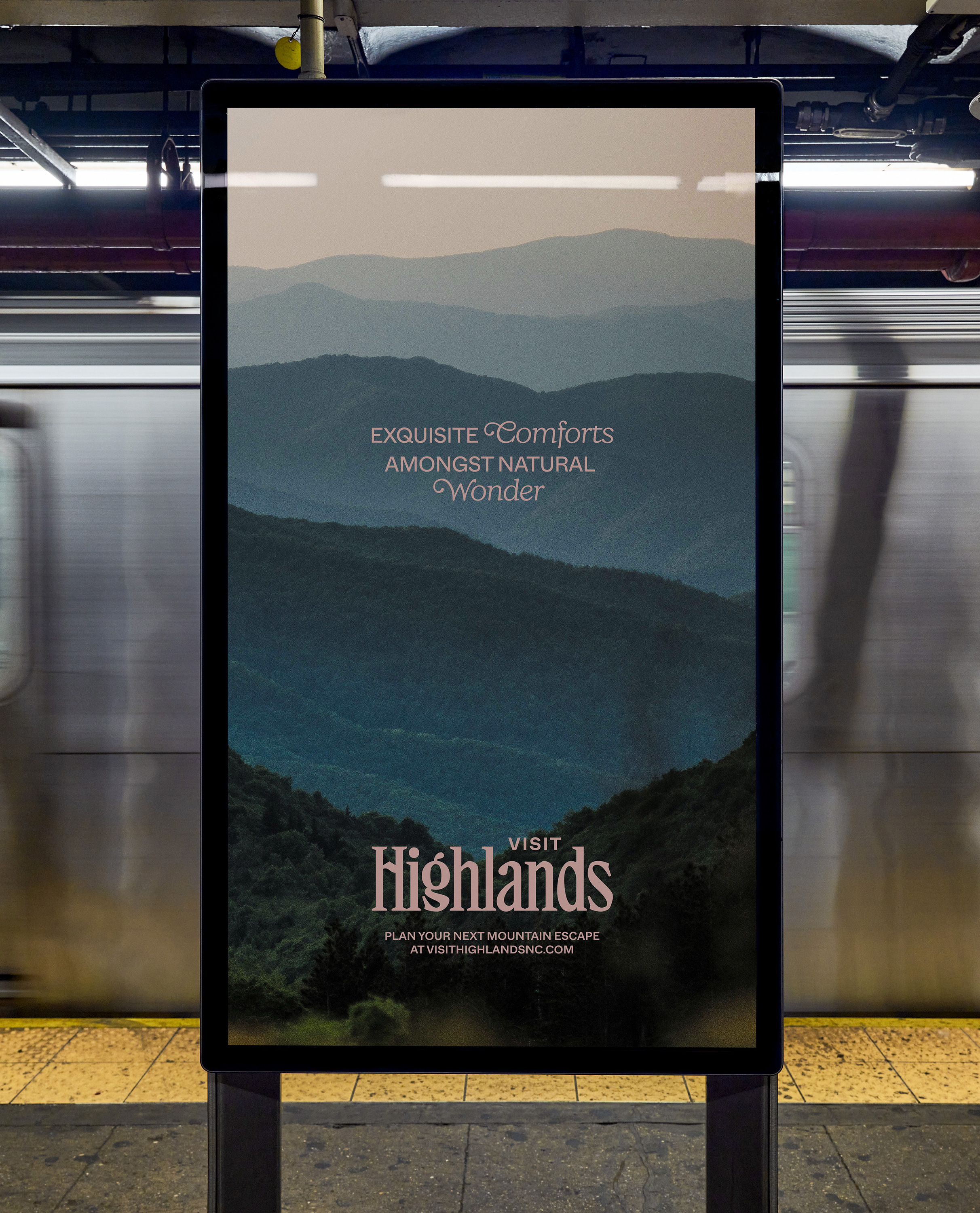
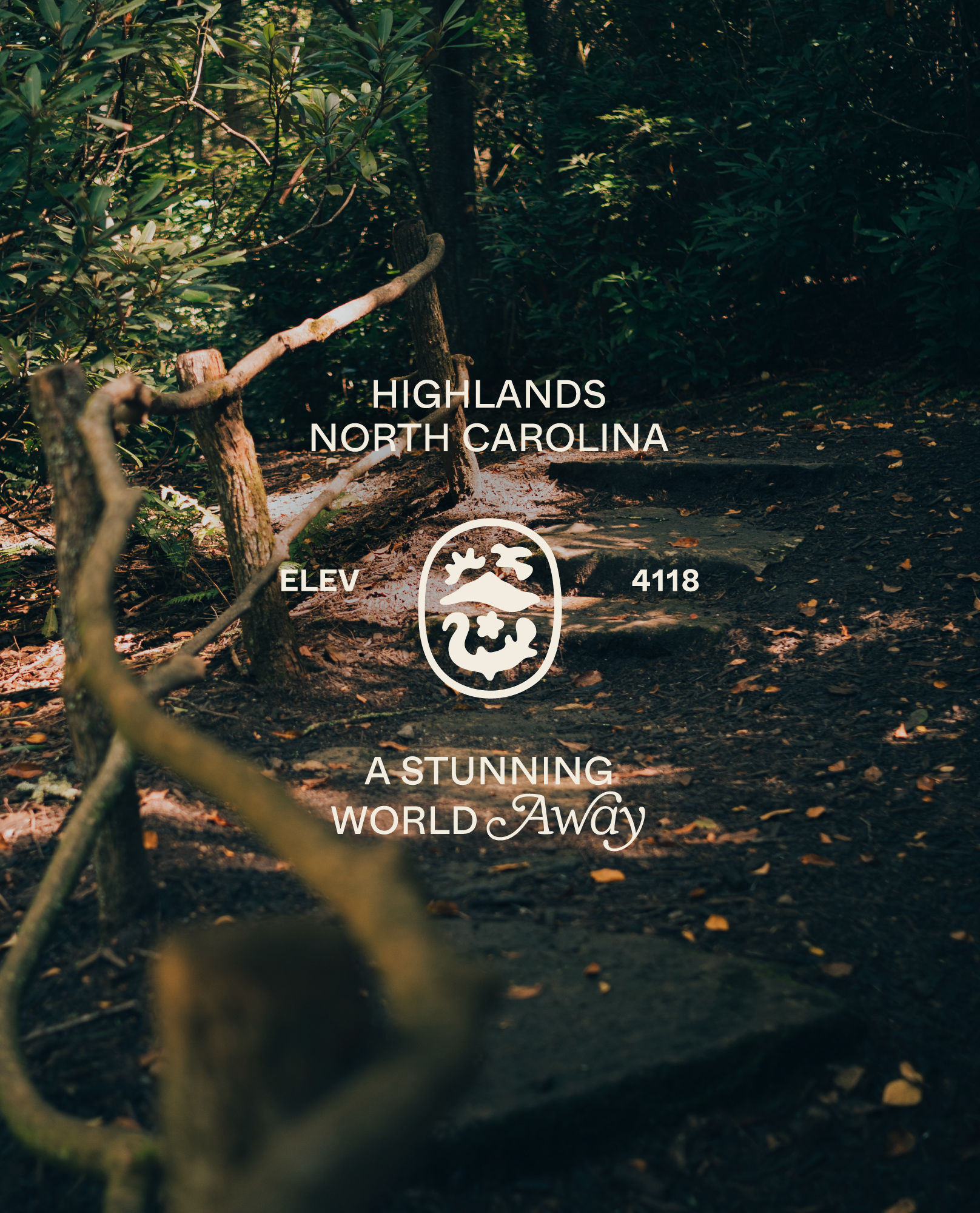
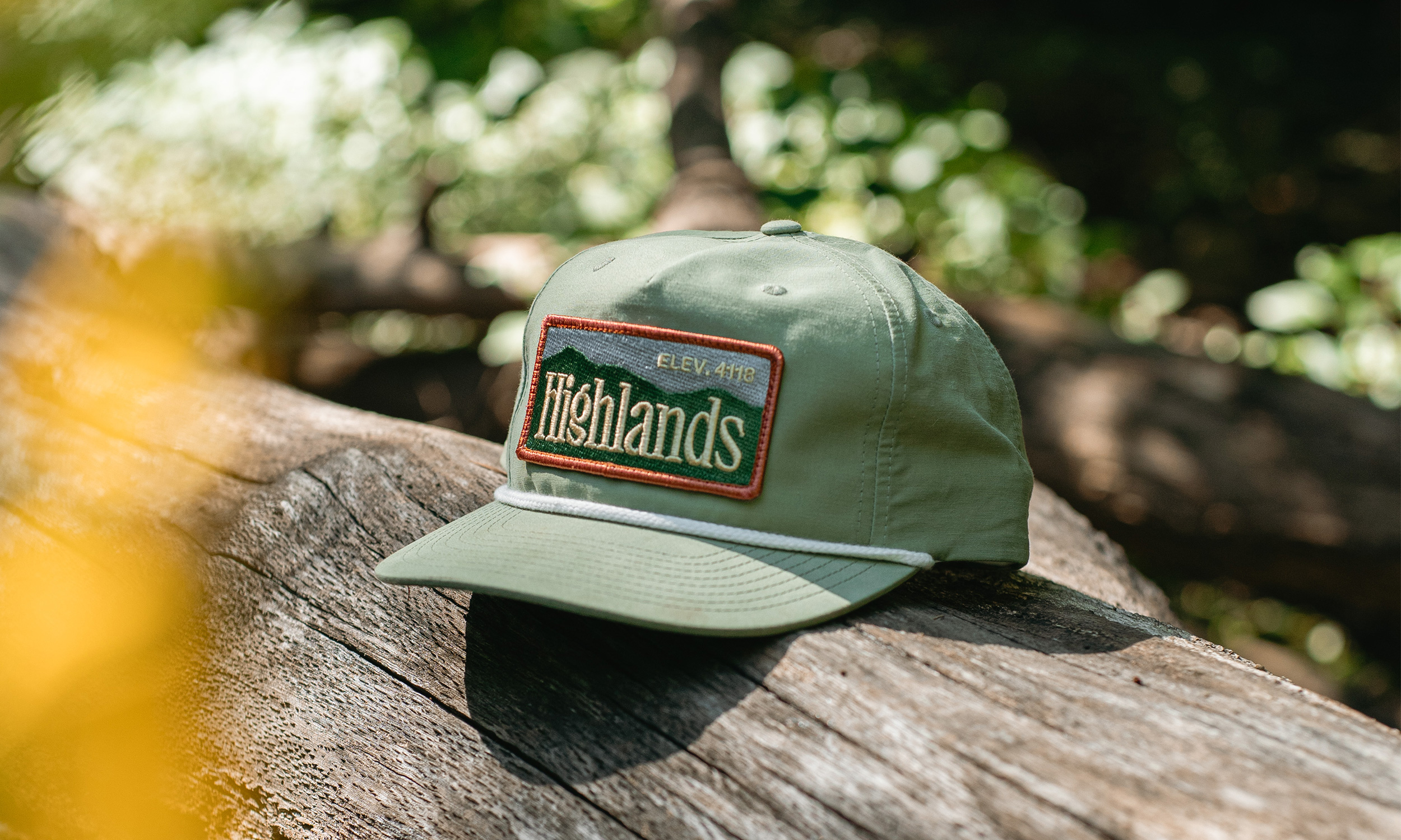
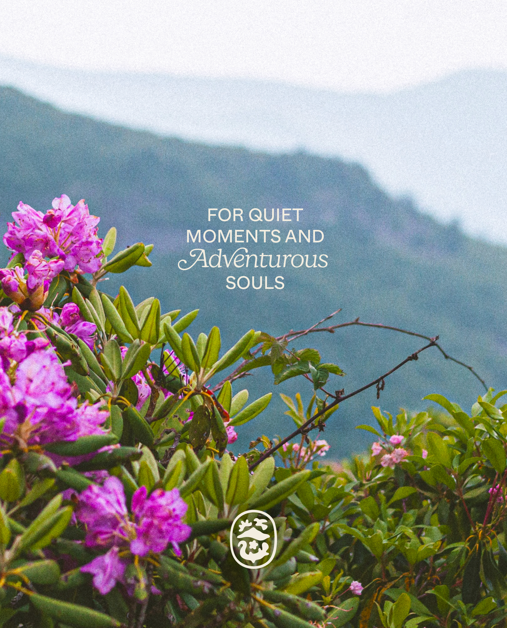
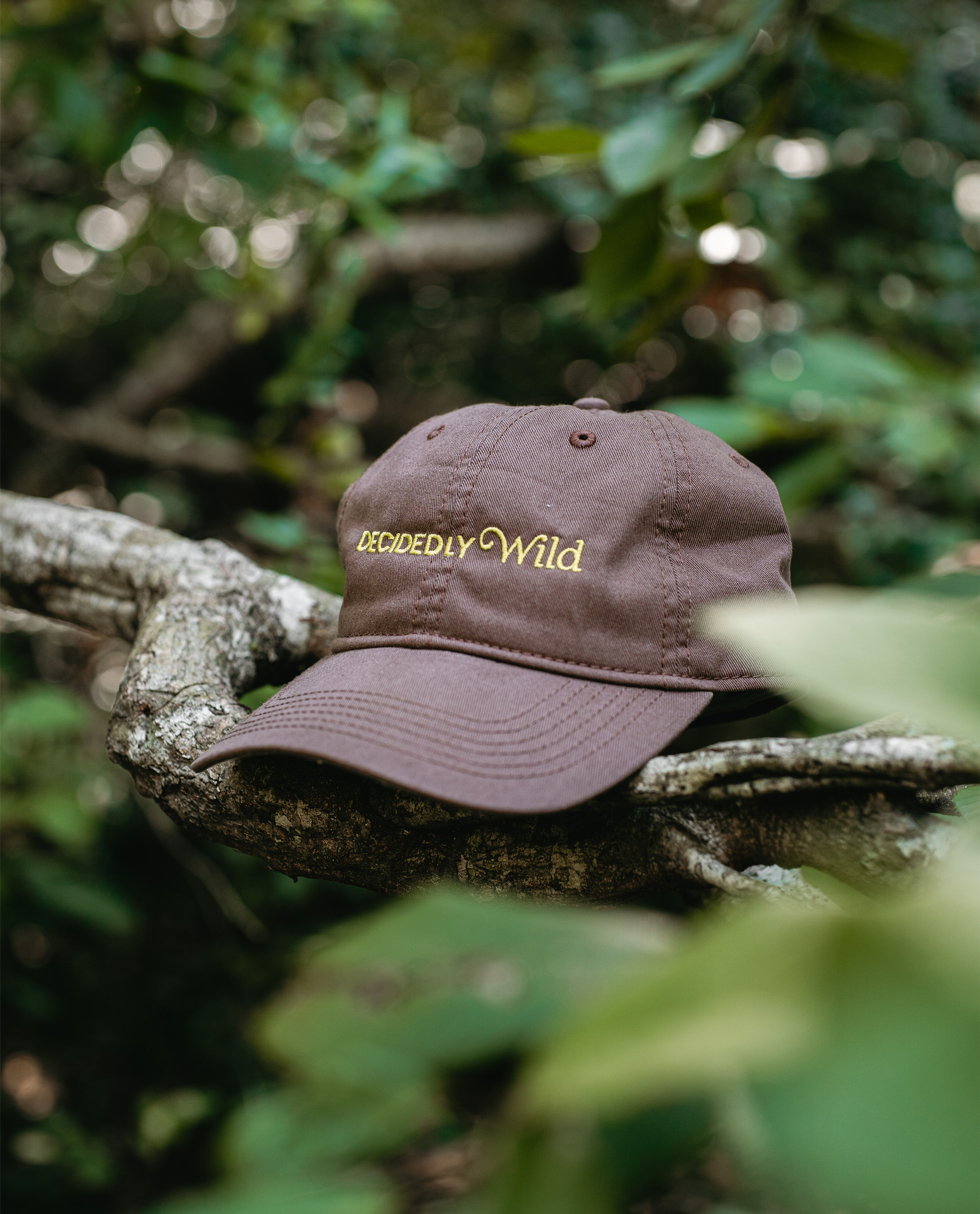
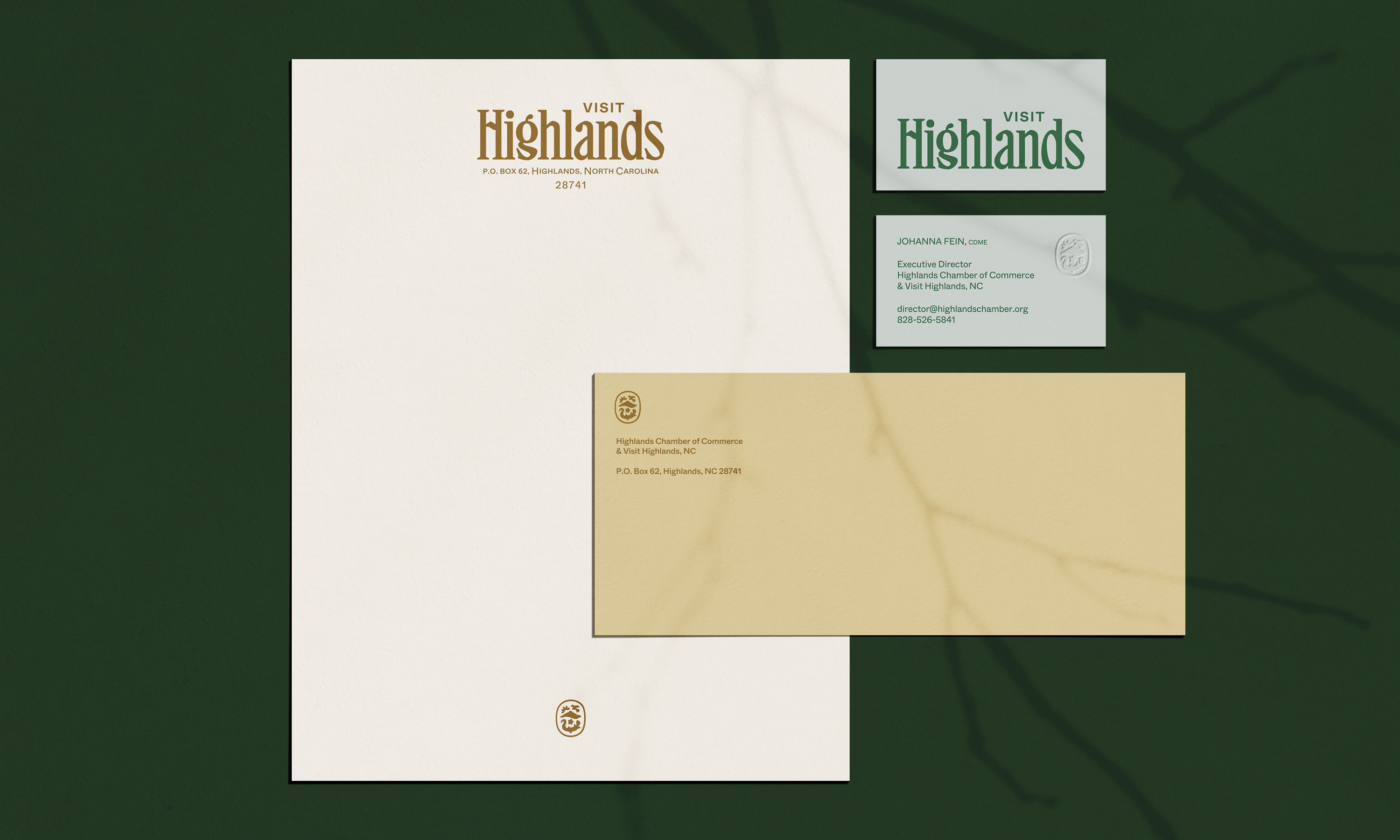
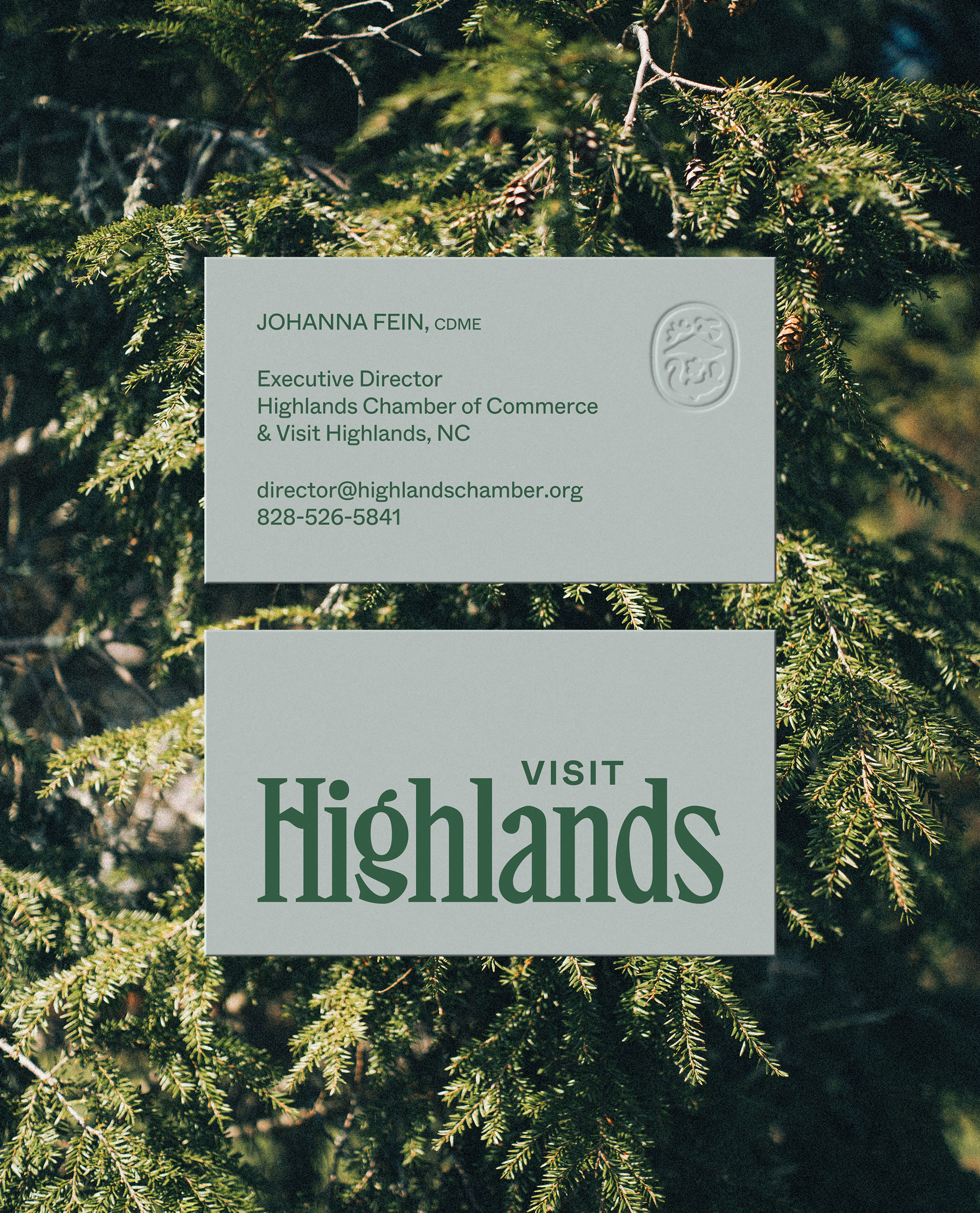
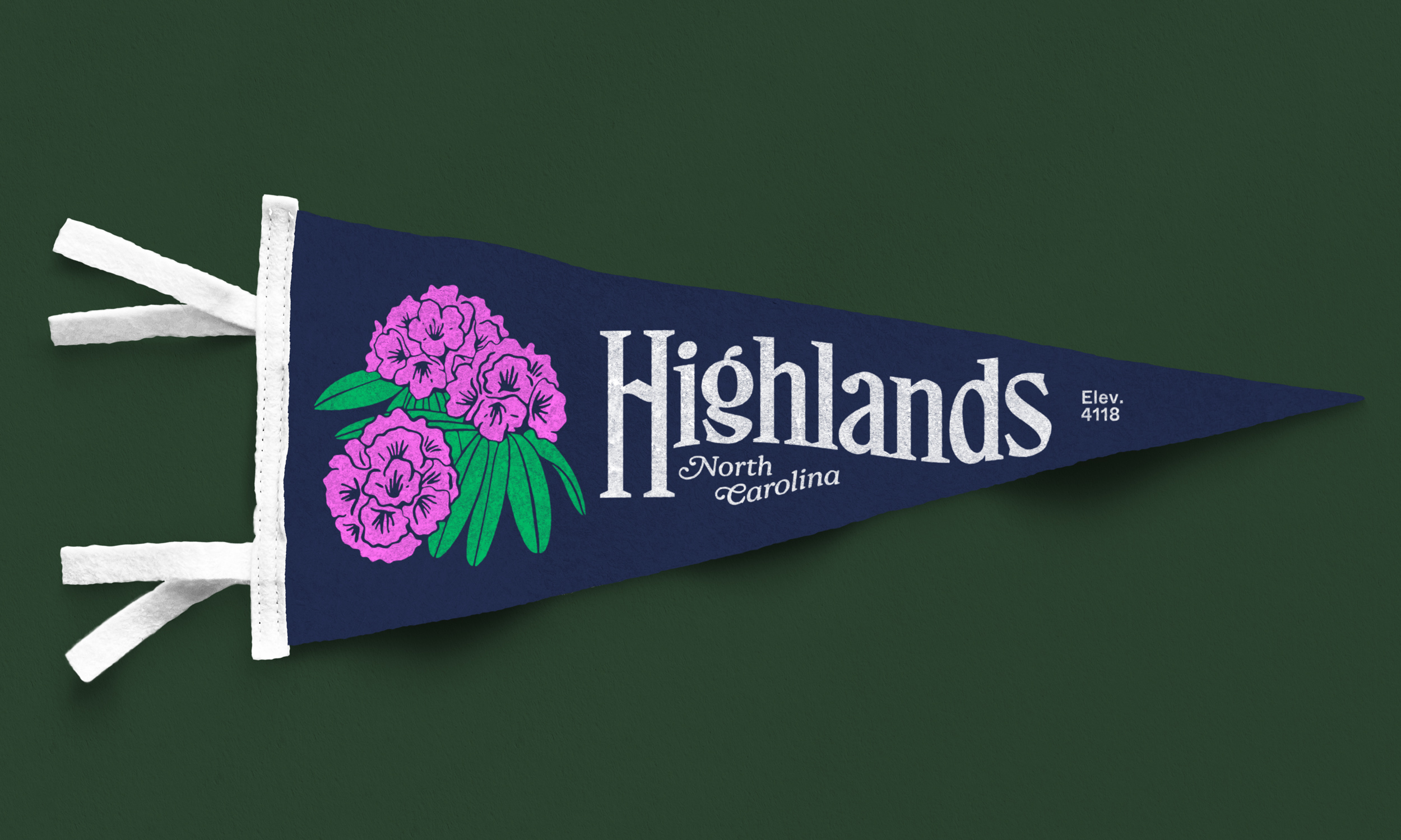
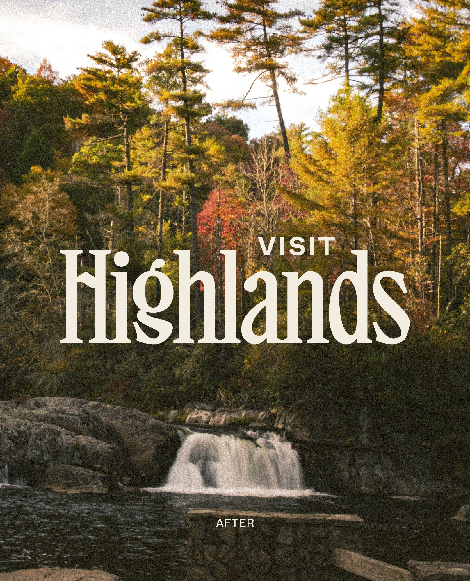
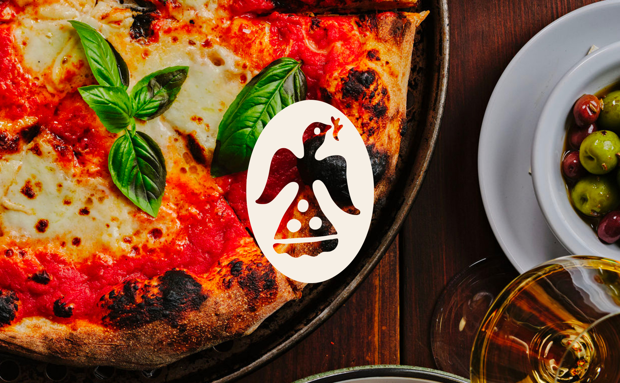
The visual identity is anchored by a custom-lettered logotype inspired by found lettering in the Highlands archive and classic Americana WPA posters. A collection of hand-drawn icons celebrates the region’s natural beauty and artistic culture, coming together in a circular badge that feels collected over time.
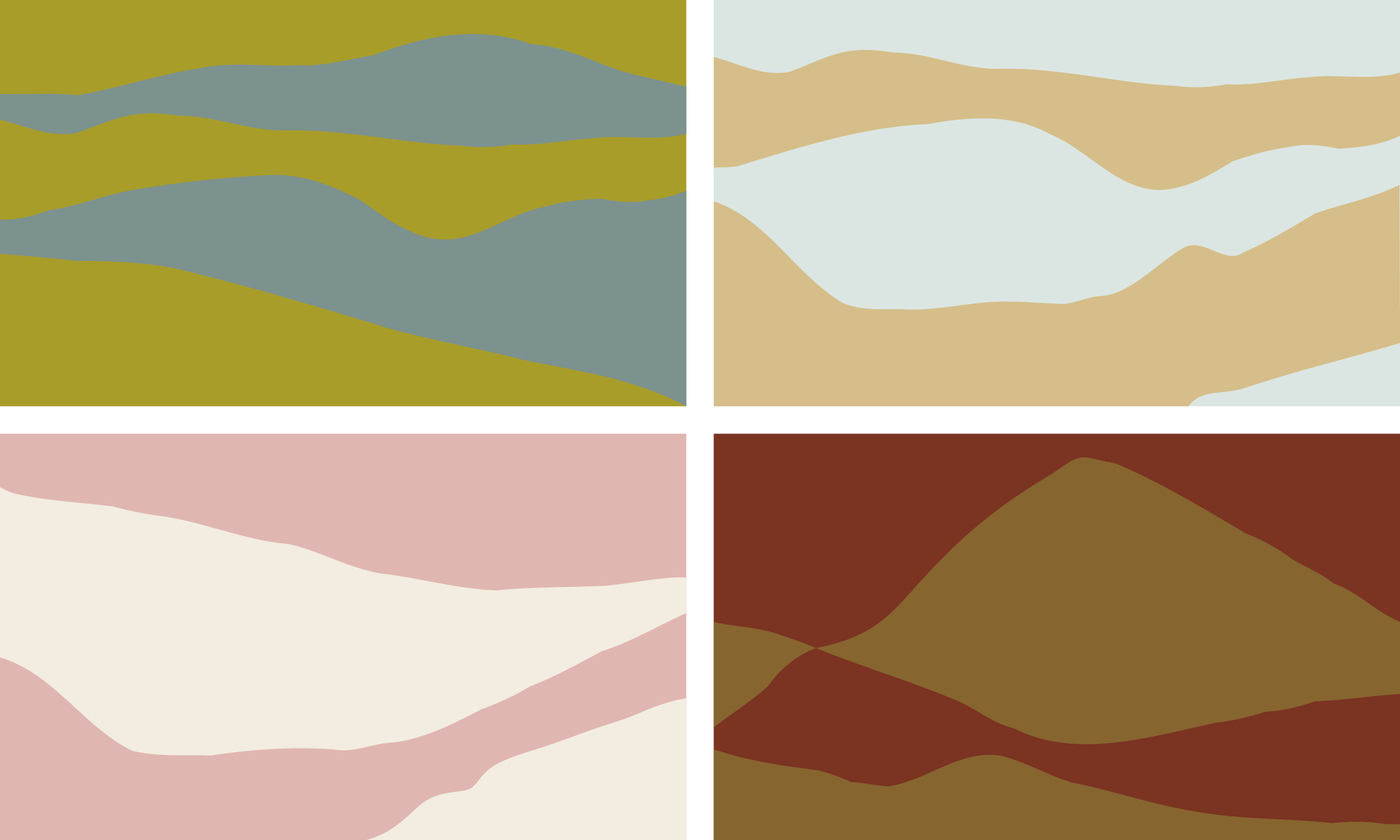
Rich jewel tones meet grounded natural hues, while supporting typography brings warmth and utility across the system. Together, the identity balances the sophistication of Highlands with its slightly wild character: whimsical yet refined, storied yet distinctly of the moment.
Business Director - Shelton Carnley
Creative Director - Josh Carnley
Strategy/Copywriter - Alden Dienethal
Project Manager - Morgan Moschetta
Photography - Alex Kiker

.svg)